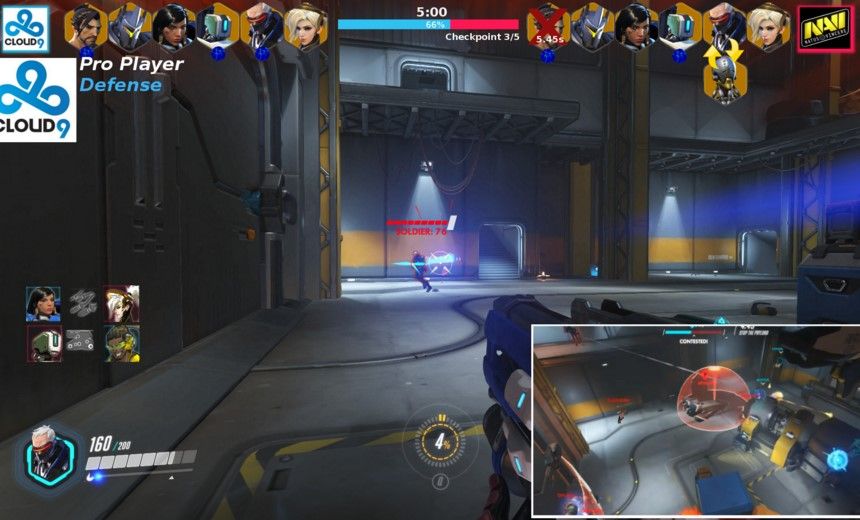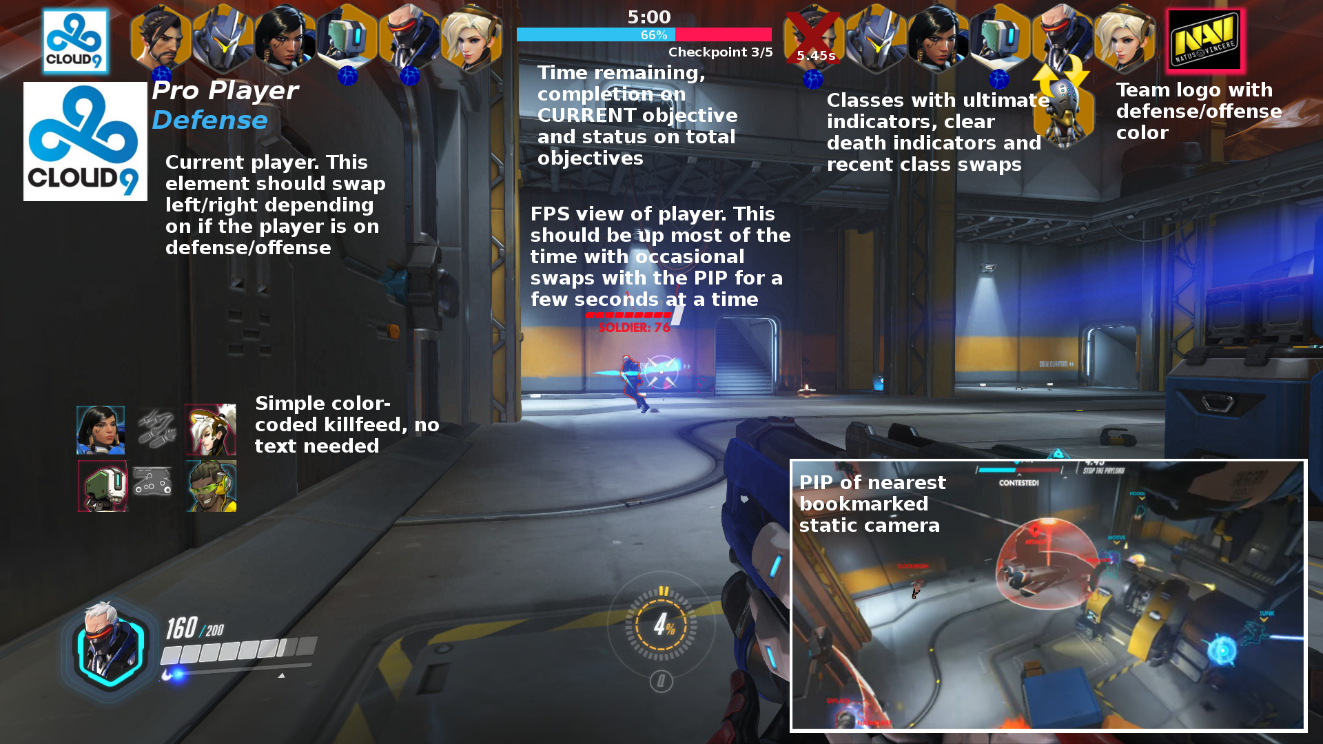
After seeing the Overwatch spectator UI in all of its glory, we wrote some suggestions about the current user interface. Reddit user /u/NoBrainer took it one step further and created a spectator UI mock-up full of eSports goodness.
Complete with rosters along the top (rather than the bottom), a simple killfeed, objective meter, player swaps, and even a picture-in-picture, the mock-up looks phenomenal. Granted, we are in early beta, but if Overwatch wants to be a viable spectator game, then copying some of these elements for a spectator UI should be a priority.
Leave your suggestions for the spectator UI in the comments.

