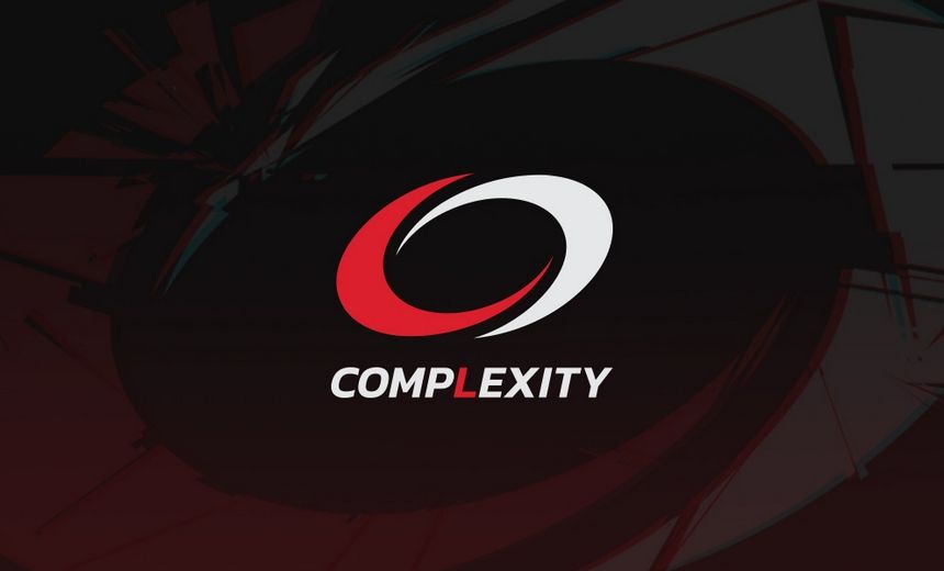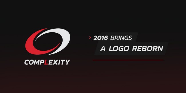
After 13 years, compLexity Gaming gives their brand a facelift in the shape of a new logo.
The old compLexity logo that we all know was created back in 2003 via a fan based contest, when the co-owner of the North American organization, Jason Lake, offered $1,000 of his own money for the best logo submission. Back then the organization name was “compLexity Syndicate” and the two graphics on the white and red logo were an “S” and a “C”. Now, without going too far from the original, compLexity have tinkered with their image and come up with a new a logo that still keeps their visual identity.
To celebrate the rebranding of the organization, compLexity Gaming has also launched a giveaway session where the team’s official merchandise with the new logo are up for grabs. There are four days left for those who want to enter the race so hurry up if you want to be one of the first proud owners of the new gaming gear.
source: complexitygaming.com

