Blizzard said they wanted feedback during the beta, and what is more fundemental to how a game plays than how a user interacts with it? The Overwatch beta user interface could use a little bit of work, here are our suggestions.
A Killfeed
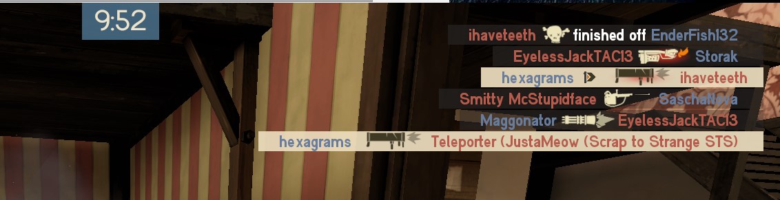
Often the only way you'll know your team lost a hero is when you here Mercy scream from across the map. A killfeed would be extremely helpful, especially in games with little to no voice comms. Knowing that your Mercy somehow died right before you pushed, without hitting tab, and without voice comms, would greatly improve every player's ability to make decisions. A small killfeed, perhaps in the top right corner which at the very least says which hero on your team died, would make a world of difference.
Ultimate Meters
As important as it is to know if your team is alive or dead, knowing when they are ready to really fight is critical. The current Overwatch UI seems like a half measure, indicating if your teammates have their ult or they don't. Why not some sort of charge meter? This would make coordinating ultimates, a huge part of the synergistic gameplay of Overwatch, much easier and more enjoyable. To be able to tell at a glance that the team should retreat or push, based on ability power, would greatly imrpove the scoreboard. Speaking of the scoreboard, the entire thing could be redesigned.

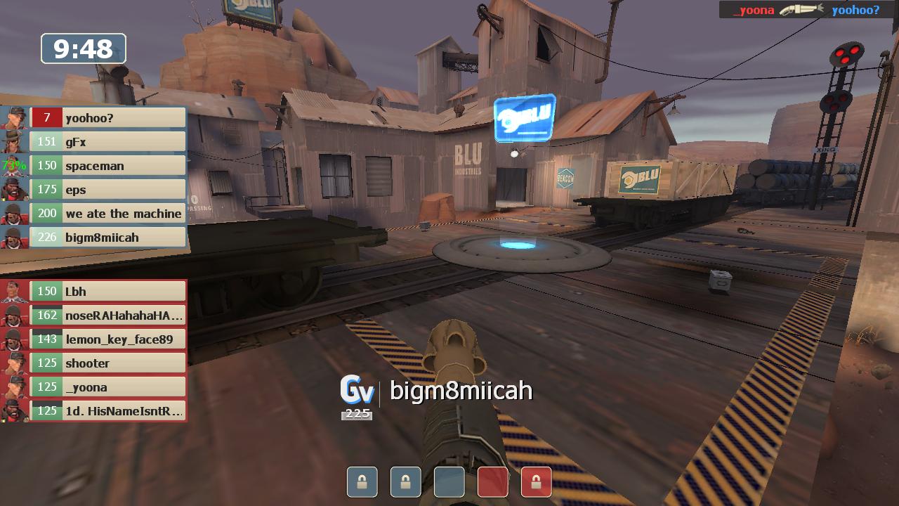
Minimal Scoreboard
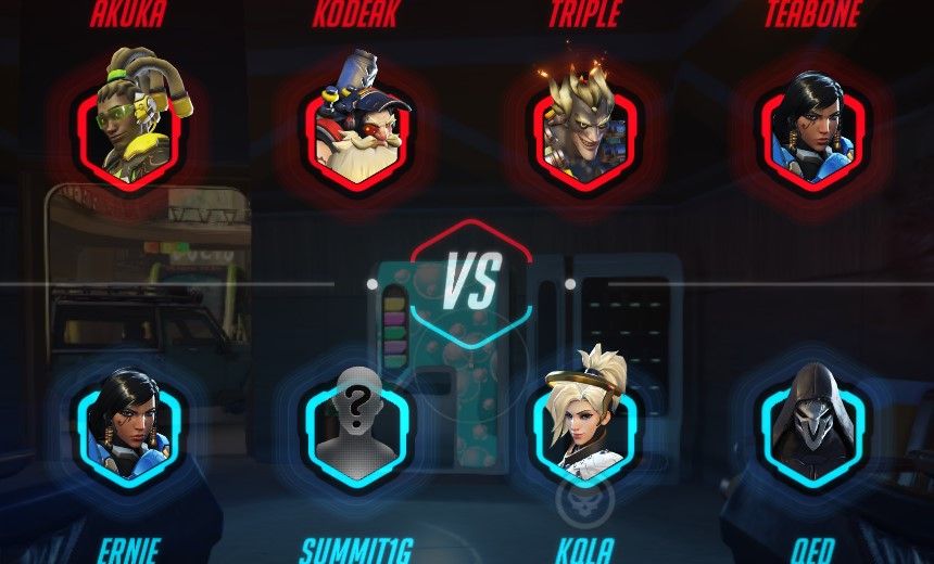
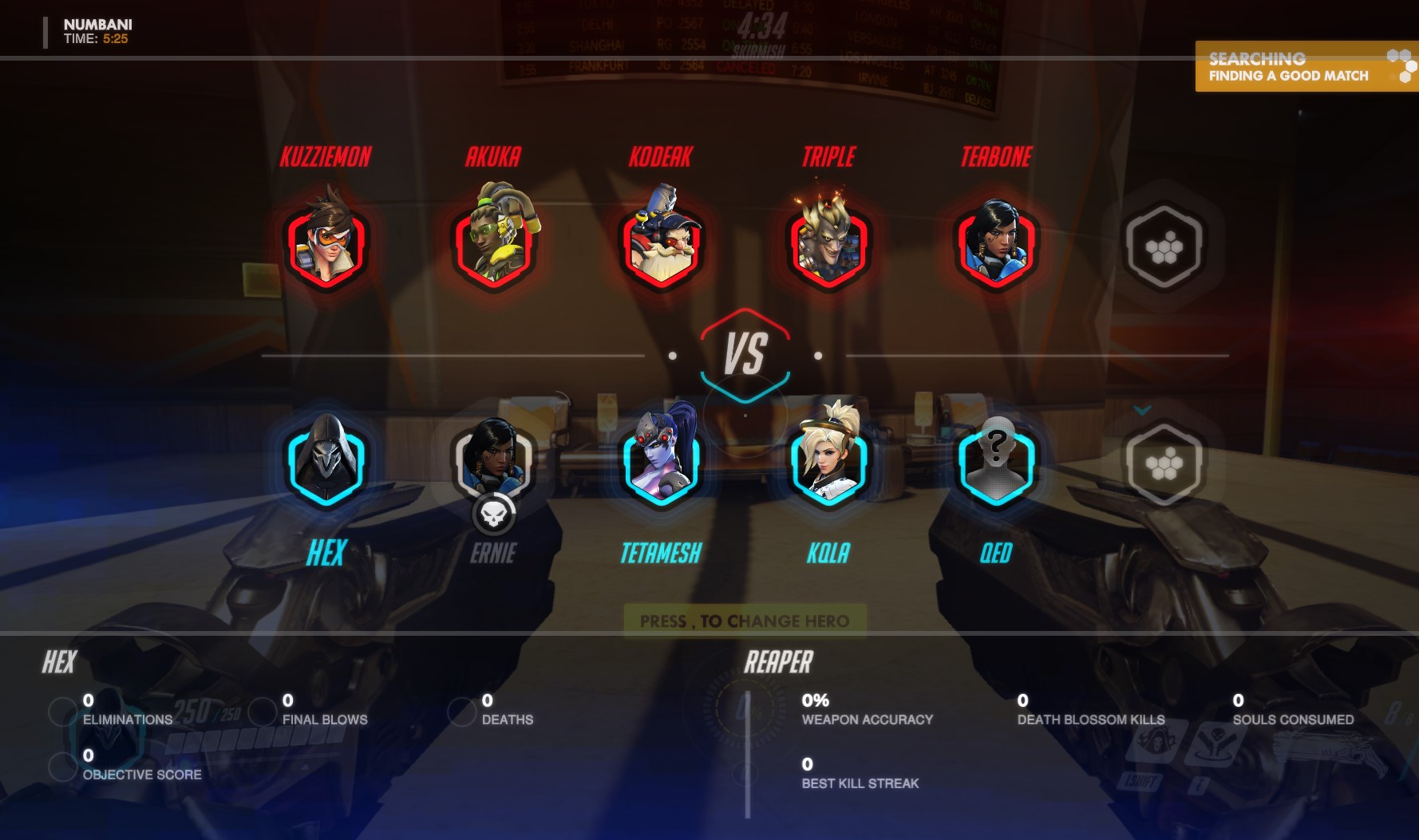
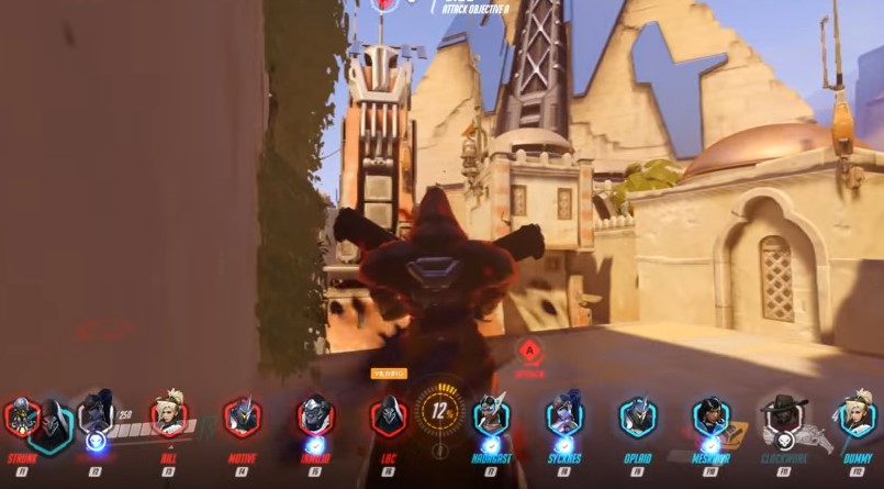
In the heat of battle, it is difficult to tab and see if your team is in any position to help you. The biggest problem with the current scoreboard is the shear sprawl of it. It takes up the entire screen, and it is often difficult to scan and find the information you're looking for. Other first person shooters have allowed HUD customization which can fix this issue. TF2 even comes default with a secondary scoreboard which can be enable in the options. Perhaps it is my reading comprehension which is the issue, but a more compact scoreboard, which could be glanced to divine important information, similar to the image seen below, would be a welcome addition to the overwatch UI.
Spectator Mode
You know why that compact scoreboard in the previous image looks familiar? Because it is the UI they use in competitive Team Fortress 2. After watching some spectator UI games, thanks for AskJoshy and Khaldor, it is apparent that the spectator UI has a long way to go. The issue with the sprawl remains, however, the most agregious issue is that the Spectator HUD overlaps with the First Person HUD, creating a cluttered spectator experience unless the camera is in free roam or third person.
Class-based shooters rely on the quick processing of information. Of course, the developers have to balance just how much information to give the players, and how much the players must find for themselves. However, the information players are given and how it is presented, could use a few tweaks.