Recently we gave you the new and improved Team Profiles here on GosuGamers. Tonight we give you the next step on our line of site improvements, it is the front page match ticker as well as the match pages. This news will provide a brief explanation of what is new.
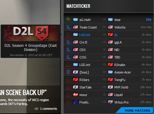
To the right, you can the current face of the match ticker. A quick comparison to the former one tells us that the all-caps is removed together. There is also a slight font change and different use of colors. Also notice the return of flags within GosuGamers' match ticker. If you hover a match with your cursor, you'll notice the pop-up with information about the match such as the tournament it's part of as well as the date it is played.
To the left of each match is a small game indicator, telling you which game the match is for (Dota 2, LoL, SC2, HoN etc). If you visit a specific section, you will obviously only see matches of the specific game section. The "More Matches" button will of course lead you to the GosuBet overview page where you can see more matches. If you click on the actual match, you will see the new and shiny match page.
At the very top of every match page is the tournament name and stage. At matching location on the right column is a banner for the tournament. This tournament functions as a link to the coverage page we have got for the tournament. If we lack such a coverage page, the link will take you to the tournament overview. Below that, every match page contains a bigger panel for betting, together with the main information (the teams, the teams' ranks and nationality, date/time and best-of-X). Further, in the right column there is a copy of the front page match ticker, allowing you to browse between different matches. Below, there is also the Top GosuBetters box where you can see the current highscore of most successful betters at GosuGamers.
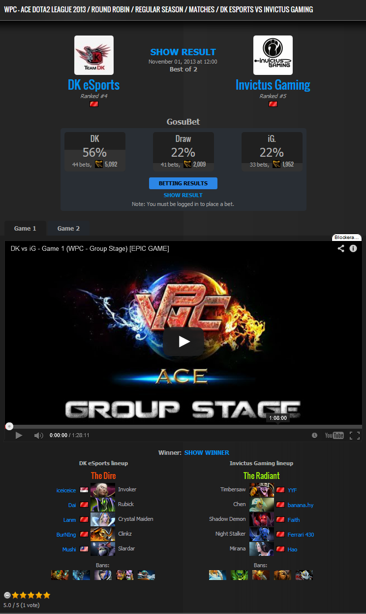
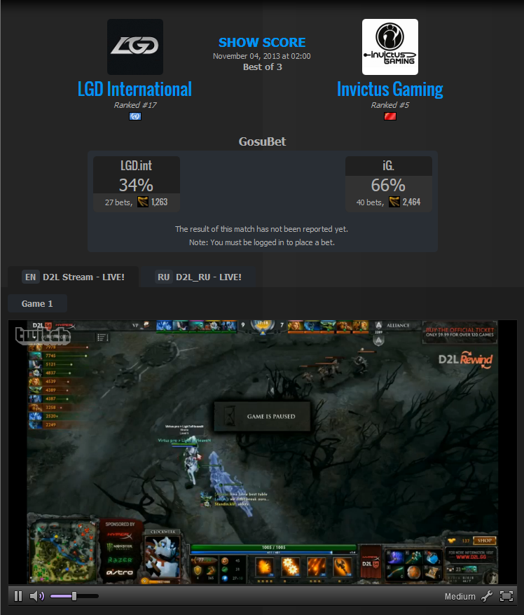
The match page is split into three different modes; Upcoming, Live and Completed. Click the images below to open a larger image of each.
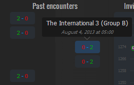
?First there is the upcoming match which mentions the streams in the top part, above the betting panel. Corresponding language for each stream is listed as well. Below you will find a graph and list of the each team's recent performances and in the middle a list of encounters between the two teams. The matches won by the team listed to the left will be listed to the left and vice versa by teams won by the team to the right. Draws between the two will be listed in the middle. And as always, hovering a result will reveal more details about the match in a small pop-up.
For the live match, those graphs and statistics are now hidden and replaced by team line-up as well as an embedded stream. You can use the stream toggle to switch between the streams assigned to the match. The line-up will be listed below the stream, or if the game has a draft added, you will see the draft. You can also toggle between the games of the match to find the draft of the other games.
The completed match looks similar to the live one, except that instead of streams there is an area for the VOD of the game. If our lovely crew members have been adding the VOD to the specific match, you will be able to watch straight from the match page, just above the draft of the specific match. That way you can always find the VOD easily of interesting match-ups, drafts and teams. Also note that all results are now hidden within spoiler-boxes, meaning if you would browse our page for a VOD or replay, you are able to open the match page and watch the VOD without getting spoiled of the result.
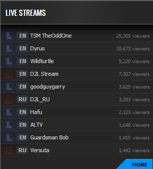 Last but not least, there is also the changed Livestream ticker, which has been granted a similar design. First there is the faded game icon as indicator which game section the stream belongs to. After that is a shortening of the language of the stream, the name of the stream followed by the right-aligned amount of viewers. At the bottom, there is a "More"-button, leading to a more complete least of livestreams.
Note that the Recent Results box remains unchanged and has not yet caught on to the new design of the other front page boxes.. Also the /gosubet overview are yet unchanged but both these will get a similar face lift in the near future. Stay tuned to find out what else will come to change and feel free to leave your feedback in the comments below.
Thank you for visiting GosuGamers!

