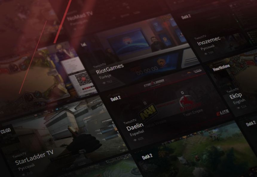
GosuGamers receives another UI update as we've revamped the streams page so you can view more channels and filter them better. Feedback is appreciated as always!
To put it simply, we knew the old look of our stream page was suboptimal at best. Such pages are a vital part of every eSports website and they should be easy and intuitive to browse, navigate and filter, so that every user can find exactly what he or she wants within seconds and we couldn't offer that until now.
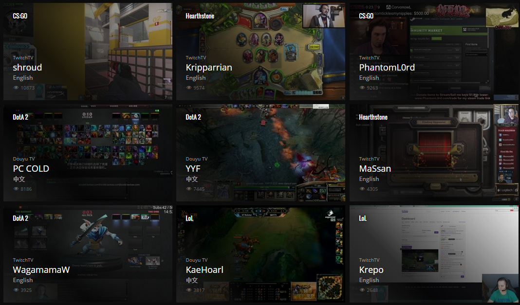
Today, we're launching the beta version of the revamped streams page. It is equipped with a ton more filters and you'll be able to sort by game, language, platform, type of stream, name, offline/online and all possible combinations. Additionally, how the streams are displayed has also been changed towards more optimal outlook. Now, you'll be able to see three times more stream boxes within one screen.

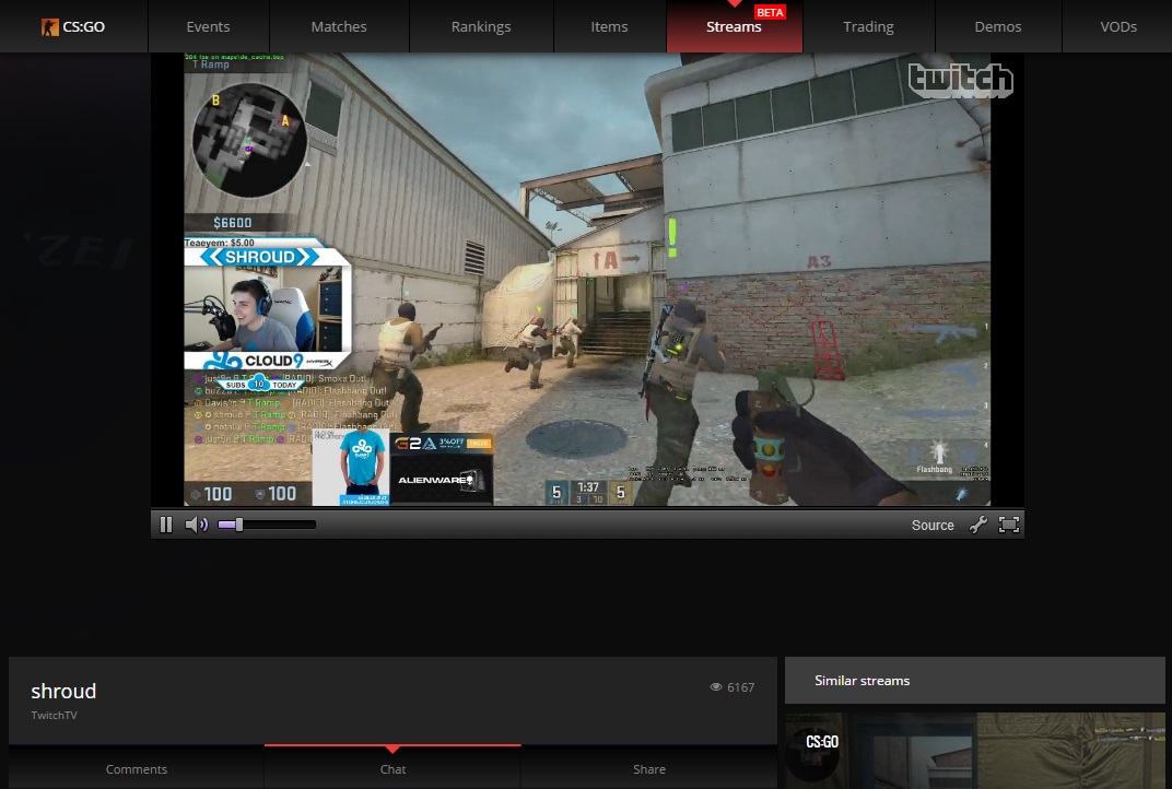
The individual stream pages have also been revamped. They are now more integrated with the rest of the stream database as from the very stream page you will be able to hop into a similar stream or browse the database without having to leave the broadcast you're watching. The chat, comment and share features have also been re-ordered.
As usual, feedback is much appreciated and you can leave your comments here or in our forum thread!


